Friday, October 29, 2010
494
I had a lot of trouble getting the angles right for these panels, since they're facing each other from across the room. But Looking at it now, I'm super satisfied with it.
Wednesday, October 27, 2010
493
Oh yes! Yes yes! That whole 4 panel reaction Ada has is just great. Quat's excessive lighting powers is one of my favorite reveals ever.
Monday, October 25, 2010
Friday, October 22, 2010
491
Started experimenting with the Noise filter at this point. Which gets useful for showing Quat's power.
Wednesday, October 20, 2010
Monday, October 18, 2010
489
I think half the reason the art quality went back up so far is that I was drawing Magic 8 Ball girl again. It did feel good to go back into my comfort zone.
Still wasn't used to making the word bubbles in photoshop, though. also quat's face gets all wonky there.
Friday, October 15, 2010
488
As much as I keep complaining about the low parts of this chapter of the story, this is my favorite fight in the whole comic.
Wednesday, October 13, 2010
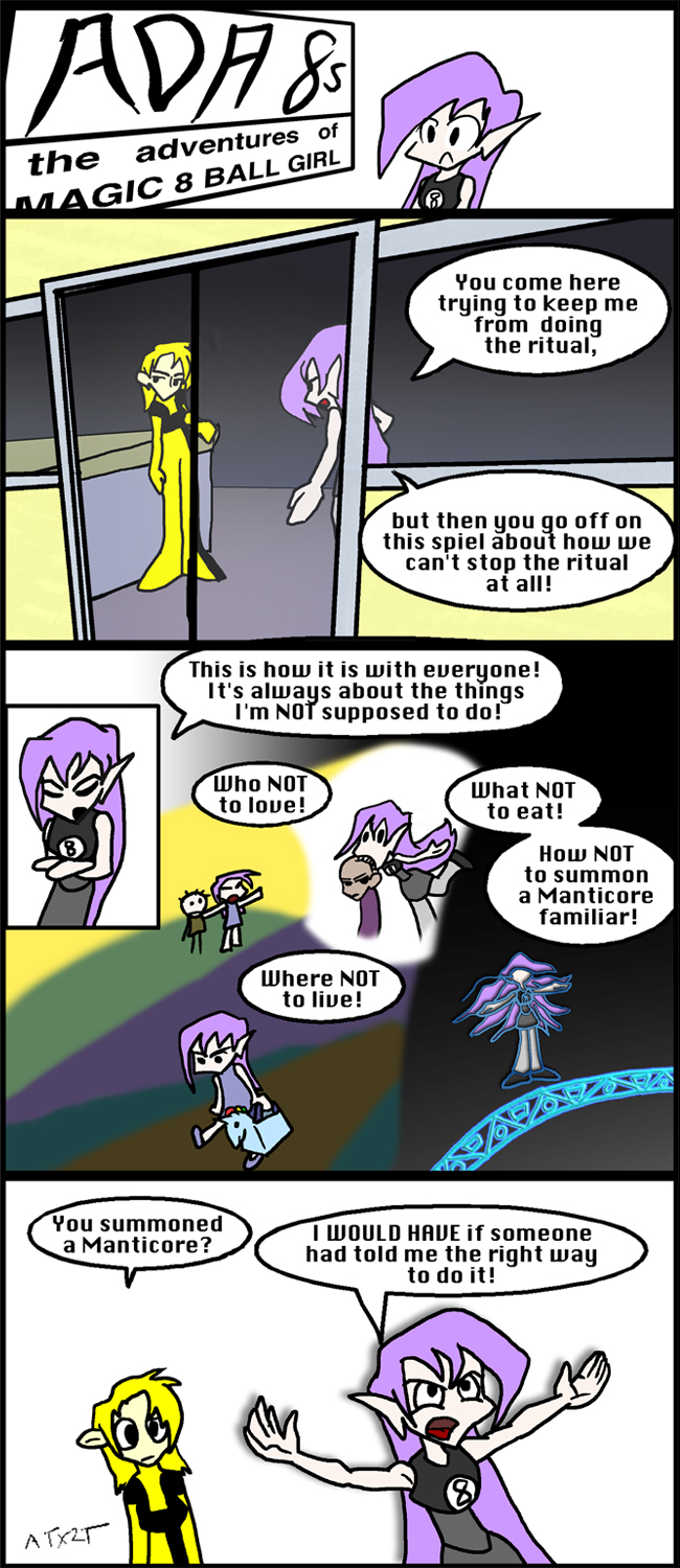
487
That splashpage of all the stuff Ada complains about was a nightmare to put together
Also, that first panel being shot from outside the building was pretty challenging as well.
The next 20 pages get really fucking elaborate. I'm not sure why I did this to myself.
Monday, October 11, 2010
486
Friday, October 8, 2010
485
Drawing characters was a lot easier in photoshop, but Compositing the overall comic became more and more of a problem.
Text boxes ended up being the worst problem. The Text tool takes forever to load up, and I can barely see what I'm writing, and it doesn't have any box binding to it, so I have to enter every line break manually and ugh... So anyway, art significantly improves, but the works gets harder just as usual.
Wednesday, October 6, 2010
484
I wish I had done a better job on this one. I'm still pretty happy with it (I like the way Shinji gets older as he's talking with IVan) but this is basically the last time he ever sees IVan alive again. It really could have been a lot better.
Monday, October 4, 2010
483
This one isn't as bad as last week. IVan pose in the last panel really shows how limited my anatomy skills are, though. Grump
Friday, October 1, 2010
482
I remember drawing this one and deciding that just couldn't draw the comic in flash any more. Looking at it now. Flash wasn't the issue.
More specifically for this page, the problem at hand was partly that the lines were too thick, but even more important, the background details were more accute. That makes the background sort of pop up in front of the characters and makes this page just completely painful to look at.
At least the title panel looks nice.
Subscribe to:
Posts (Atom)


